The history of the political poster is long and disputed, but generally dates back to 19th century Europe. However, political propaganda posters did not really gain widespread popularity until World War I. Early in US history, political candidates would send around information via pamphlets with their name and an image. These early examples were purely informative, and while they could be considered art, the locust of “artistic” propaganda and campaign posters is rooted in the 20th and 21st centuries.
Around World War I, the need for aid and assistance grew, and appealing to the general public was essential. Eye-catching graphics and a compelling message proved effective tools for mass produced posters. With these essential principles of design, artists were able to create a memorable and successful campaign.
The first poster in question is from WWI, advertising a campaign for knitters to make socks for servicemen stationed at the front lines.
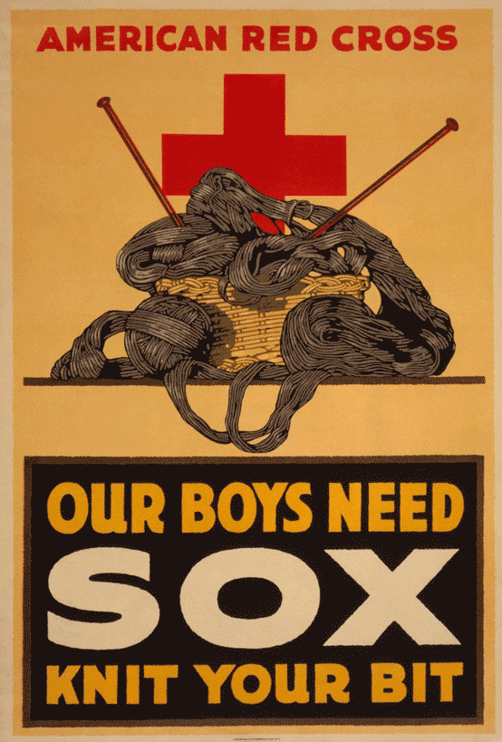
The first element that draws the viewer’s eye is the very clear message “Our Boys Need Sox Knit Your Bit.” Enclosed by the large dark box that immediately catches the eye, the inspiring call of the campaign is clear. The use of scale on the word “SOX” clearly communicates what it is the Red Cross was looking for. The angle of the knitting needles and the movement of the yarn also leads the eye back down to the important information. While not perfectly symmetrical, there is plenty of balance from the left side to the right side, a universally satisfying principle of design. The warm color palette, while popular at the time, also lends warmth and hominess to the poster, encouraging everyday people to take up a greater cause.
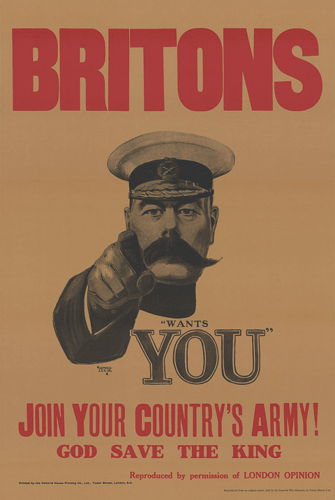
After the start of WWI, the need for more troops in Great Britain increased, and an iconic poster was created. Designed by Alfred Leete in 1914, the poster depicts Lord Kitchener pointing at the viewer. This poster inspired many copies, most notably the “Uncle Sam Wants You” version in the United States. Similarly to the knitting poster, this poster also plays with scale to bring the eye around to the important sections. The foreshortening of the pointing arm employed new artistic norms to give the effect that he is directly pointing at the viewer, individualizing the visual experience.
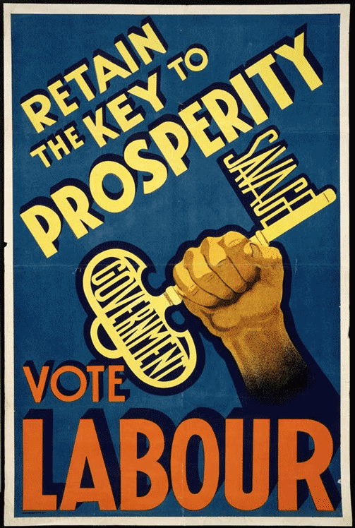
The popularity of political propaganda posters only increased after WWI. Posters for campaigns, government motions, and opposition parties flourished. Take the 1938 poster for the Labour Party in England, for example. The first aspect that a viewer may see is the stark contrast between the background, the text, and the imagery. The slanted angle of the text at the top mimics the angle of the key in the middle. This movement centers the eye in the evocative image of a clenched fist. Unlike previous posters, scale isn’t the primary design factor, and the emphasis is rooted contrast and dynamic positioning. The key is composed of text itself, the “Savage Government” phrase a subtle and witty rebuke of dominant political forces.The stability of the “Labour” text both in the alignment of the text and the color that was used introduces themes of strength in relation to the Labour Party itself. This positioning implies that if one were to vote for the Labour Party, it would bring stability to an askew government.
When WWII began, another round of wartime posters were commissioned by the British government. Artist Abram Games designed multiple posters, all with various messages to the people, from growing your own food to warnings about illicit behaviors. His work took a very interesting approach with a split of text and imagery based posters. One such poster is one warning soldiers about talking to the wrong people and potentially endangering the lives of servicemen.
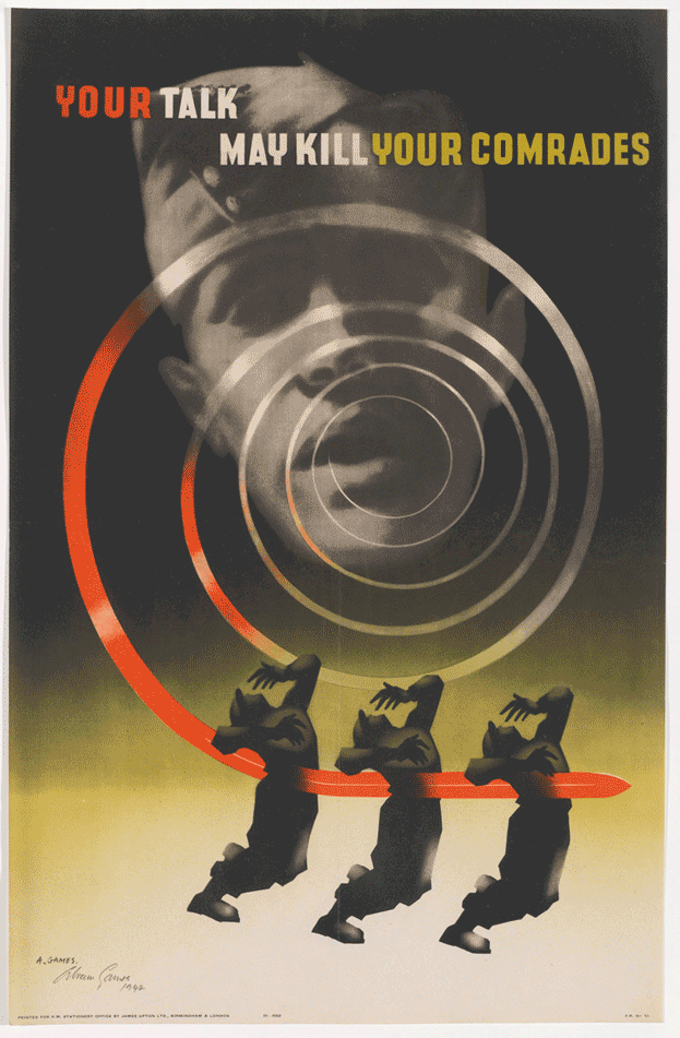
This particular poster combines a number of contemporary design principles to elicit an emotional response. Unlike previous examples, the text is not the primary communicative principle, instead reinforcing the dizzyingly terrifying image. The strong use of movement in the radiating spiral leading to three figures being pierced by a sword conveys the urgency and seriousness of the issue. The repetition of the figures highlights the stakes of the issue, and the vague, centralized face of the soldier puts a contemporary viewer into the image. The intense red of the spiral matches the red of “Your,” which further links the soldier and the consequences of their actions.
Another iconic poster from WWII is the “Rosie the Riveter” poster that encouraged women to join the workforce, particularly in the defense industry. Designed for Westinghouse by J. Howard Miller, the poster features the profile of a woman with her arm flexed. She is shown wearing coveralls and a bandana with a fierce look of determination in her eyes. Above her is a text bubble that says “We Can Do It!”
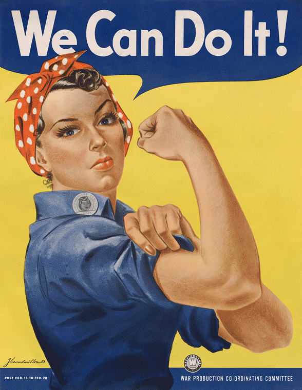
Here again, contrast is used to emphasize the foreground. The yellow is energetic and attention-grabbing, equating the energy of the modern women to Rosie’s strength. The bulk of Rosie’s body lies on one side of the golden ratio line, while the strong arm is on the other side, a visually satisfying concept overall. The positioning of her arm leads the eye up to the text, the short, punchy message a perfect slogan for the movement. The power of this poster and the meaning behind it has remained constant to this day, with multiple renditions of it being created for various movements, most recently images of frontline doctors and nurses fighting COVID-19.
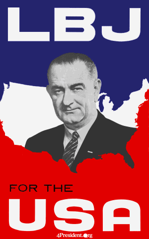
In the early 60s, variations of Lyndon B. Johnson’s campaign poster began to utilize design techniques. Johnson was portrayed looking at the camera, looking away, or with his running mate. Partially due to the growth of photographic interest at this time, photography is heavily used in political posters between the 60s and early 2000s. Interestingly, the text is the focus of the piece, its colorful background contrasted by the black and white image. This image follows a composition technique called the rule of thirds, where the image is broken up into three columns and three rows, with the important elements falling into each one of those sections. Additionally, the layout of the red and blue, iconic colors for US politics, frames Johnson’s portrait, highlighting him as a patriotic American candidate. With Johnson in the middle, he can be shown “bridging the gap” between Republicans and Democrats, bringing the country into the middle.
US posters in the 1970s through the early 2000s showed much of the same style; an image of the candidates in the center with a heavy use of red and blue and other patriotic imagery. In 2008, the return to graphic posters came in the form of a poster by Shepard Fairey.
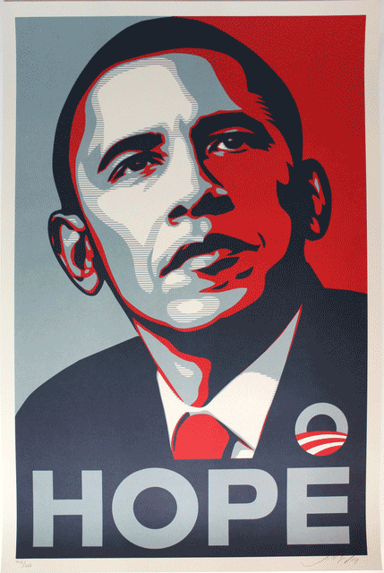
Barack Obama’s presidential campaign posters were an immediate hit, with multiple imitations flooding social media. The poster itself is simple, with a portrait of President Barack Obama with a single word “Hope” underneath. Contrast is used in this poster via the “paper cut out” style to create forms from the dark tones up to the light. “Hope” is integrated into Obama’s figure, presenting him as the literal embodiment of virtue. The use of color shifting is also prominent, as this poster isn’t a primary red or blue, but more of a nuanced color palette. This change in pace from previous campaign posters signaled a youthfulness and “coolness” of a new campaign.
Another effective poster in the 2010s came from the Hillary Clinton campaign of 2016. Designed by Michael Bierut, the logo is a simple H with an arrow passing through it. While it wasn’t an instant hit, and caused some uproar within the graphic design community, it does tell a story. First and foremost, the Clinton 2016 poster is the most pared down of the posters in this article, and it marks a new era of campaign design which is simplistic, and stark. Strong lines and blocky shapes lend an aura of strength and stability, while the arrow passing through shows progress and movement. The combination of these elements combine to form an H, successfully advertising the candidate. This poster and others from 2016 do show a return to the primary blue and red amidst a more divided political landscape.
Throughout history, posters employ a number of design techniques to subliminally message their viewers and pull in attention. Political posters and advertisements use the part of the brain that responds to art, connecting to people on a more emotional level. Graphic design has been and continues to be a strong form of communication, and it will be interesting to see how it progresses over time.